Simple Scatter Plot by Categories
The scatter plot shown below demonstrates the categorisation by colour within Stata.
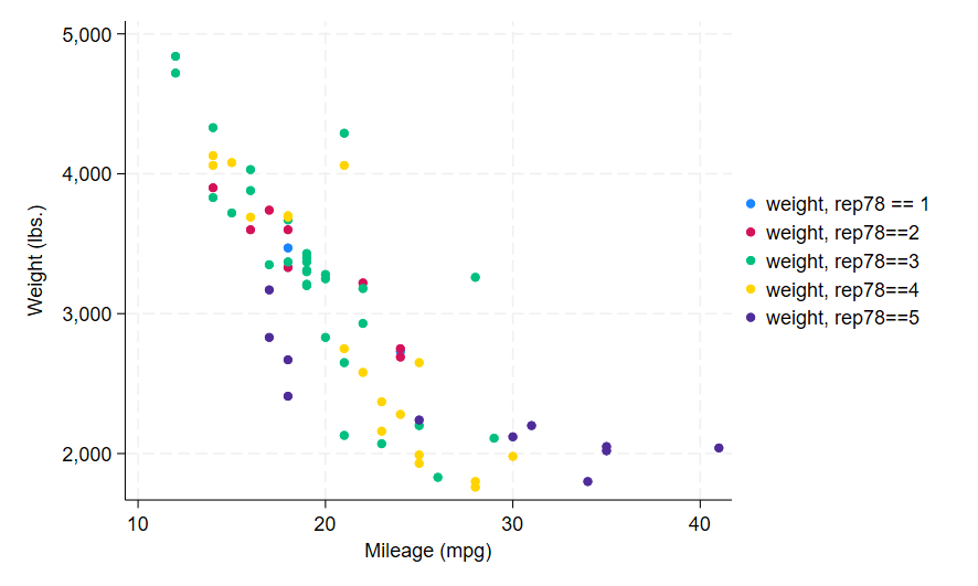
The following code can be used to create the graph above.
sysuse auto, clear
twoway (scatter weight mpg if rep78==1) (scatter weight mpg if rep78==2) (scatter weight mpg if rep78==3) (scatter weight mpg if rep78==4) (scatter weight mpg if rep78==5) , name(a1) legend(label(1 "weight, rep78 == 1")) legend(label(2 "weight, rep78==2")) legend(label(3 "weight, rep78==3")) legend(label(4 "weight, rep78==4")) legend(label(5 "weight, rep78==5"))