Stata Histograms - How to Show Labels Along the X Axis
When creating histograms in Stata, by default Stata lists the bin numbers along the x-axis. As histograms are most commonly used to display ordinal or categorical (sometimes called nominal) variables, the bin numbers shown usually represent something. In Stata, you can attach meaning to those categorical/ordinal variables with value labels. To learn how, check out this Tech Tip about The label command. When you have labels attached you can get these to display on your histogram. In this post we show you how to attach these labels to your histogram, in place of the base numbers.
How to Use:
histogram variable, xlabel(1(1)x, labsize(insert_size) angle(set_angle_if_needed) valuelabel)
Worked Example:
In this example I am going to use an economic dataset I developed called “econostata.dta”. In this dataset is the categorical variable “category”, which separates purchases into 9 different categories. As this variable is categorical that means it is discrete rather than continuous, and I am going to show frequency on the y-axis rather than the default density. I also don’t want the x-axis to show a title, as I am already showing all the category names instead. In the command pane I type the following:
histogram category, discrete frequency xtitle("") xlabel(1(1)9, labsize(vsmall) angle(45) valuelabel)
This command produces the following graph:
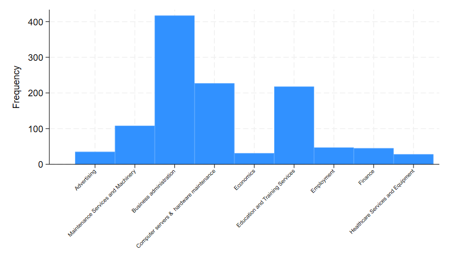
To break down the command I used, the option xtitle(“”) prevented the variable name “Category” from appearing as a title along the x-axis. Instead we only see the category names and the “Frequency” label for the y-axis. Within the xlabel() option the 1(1)9 meant that all numeric categories are shown separately along the x-axis (there are 9 categories total); labsize(vsmall) tells Stata how small I want the category text to appear; angle(45) tells Stata I want the labels to appear at a 45 degree angle; and valuelabel tells Stata to show category labels rather than just the number assigned to that category.
If you would like to play around with this dataset I have linked it here.