The avplot(s) Command - Linear Regression Post-Estimation Plots
The avplot command plots an added-variable plot of the dependent variable and one independent variable from a multiple regression. An added-variable plot is sometimes also known as a partial-regression leverage plot, a partial regression plot, or an adjusted partial residual plot.
When you have a simple linear regression (one independent variable only), you are able to graph both variables (dependent and independent) with the regression line all in one graph. This gives a reasonable indication of the relationship between dependent and independent variables.
For a multiple regression this is more complicated. The relationship between the dependent variable and independent variable A will impact the relationship between the dependent variable and independent variable B. This makes it more difficult to observe the exact relationship between variables. The avplot command generates a graph that shows the relationship between the dependent variable and independent variable A while holding all other variables constant. It is an indication of the true relationship between variables in the model.
The slope of an added-variable plot indicates the amount of influence an independent variable is having on the dependent variable. These plots are also useful for identifying outliers. The avplot command will plot a single independent variable of your choosing. It is worth noting that you can specify an independent variable that is not yet in the model using avplot, so you can see whether it would be a good addition to your model. The avplots command will plot all added-variable plots (one for each independent variable in the model) in one graph image.
Worked Example:
For this example I am using the Stata auto example dataset. I will run a multiple linear regression and then use the avplots command to look at the relationships between each independent variable and the dependent variable. In the command pane I type the following:
sysuse auto, clear
regress weight length displacement trunk turn
avplots
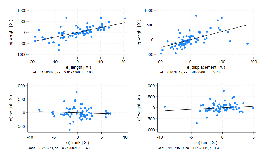
This produces the following composite graph:

From these plots I can determine that the independent variable length has the strongest linear relationship with the dependent variable weight. The independent variable displacement also appears to have a linear relationship with weight, but it is not as strong. Both independent variables trunk and turn do not appear to have any linear relationship with weight in this model.
Let’s take a closer look at the avplot for displacement, as the linear relationship we see here is questionable. In the command pane:
avplot displacement

This generates the same weight v displacement plot shown in the composite above, but it is bigger and easier to evaluate visually.
There are some issues that you can see with this graph. The linear line-of-best-fit appears to rely heavily on only a few plot points in the right side of the graph to get its linear fit. There are many more plot points on the left side of the graph but these appear more scattered and unrelated. I’d say that there are outliers here that are influencing the graph too much for the relationship to be considered properly linear.
From these avplots I can determine that only weight and length have a good linear relationship in this regression.
There is one additional use for the avplot command. It can be used on other variables in your dataset that you did not include in your model, to evaluate whether that variable would be a good addition to your model. Let’s see whether the mpg variable would benefit our model. In the command pane:
avplot mpg
This generates the following graph:

There appears to be a small linear relationship here. This relationship is a better fit than either trunk or turn, so perhaps mpg would be a good substitute for those two variables.
The avplot and avplots commands are a useful way of visually evaluating the relationships in multiple linear regression models. They can give a better indication of the relationships between variables than just using the regress p-values. A p-value will tell you whether or not a relationship is statistically significant, but it cannot tell you what that relationship looks like. The avplot for the mpg variable above is a good example.
If the mpg variable is added to the regression above and both trunk and turn are removed, the p-value given for mpg is 0.031 - which is statistically significant. However, we can see from the avplot above that although the relationship is statistically significant, it is also only having a small practical effect on the dependent variable weight. If the mpg is consistently impacting the weight of the vehicle, but the impact is only 1 ounce of weight per 5 mile change in mpg (miles per gallon), then mpg is not having any practical effect on the weight of cars when they weigh between 1700 and 4900 pounds.
Something that is statistically significant is not always practically significant. The avplot and avplots commands can help to illustrate the practical effectiveness of relationships.