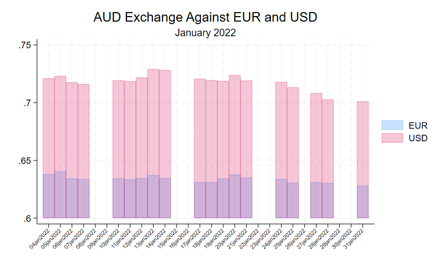
Transparency in Stata Graphs
In Stata transparency of graphs can assist in making graphs easier to interpret when there is overlap. Using a dataset of Australian Dollar exchange rates for January 2022 we have drawn a chart showing the AUD versus Euro and the USD.
Here is the code that we used:
import excel "https://www.rba.gov.au/statistics/tables/xls-hist/2018-2022.xls", firstrow cellrange(A11:X1267) case(lower) clear
rename fxr* *
label variable usd USD
label variable eur EUR
twoway bar eur seriesid if seriesid >= `=td(1 jan 2022)' & seriesid <= `=td(31 jan 2022)', color(%30) || bar usd seriesid if seriesid >= `=td(1 jan 2022)' & seriesid <= `=td(31 jan 2022)', color(%30) xlabel(#28, angle(45) labsize(vsmall)) xtitle("") title(AUD Exchange Against EUR and USD) subtitle(January 2022)