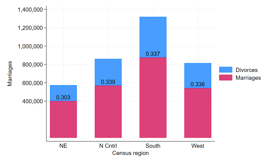
Vertically Stacked Bar Graph
This post displays a vertically stacked bar graph. This particular type of chart is good for displaying similar data of the same variables, separated into control areas. For example this particular graph compares the marriages and divorces across different living areas. One could recognise from these graphs that in the North East region, there are few marriages and divorces, however in the South, the amount of marriages thus the divorces is relatively high.
The following code can be used in Stata to create this graph:
sysuse census, clear
collapse (sum) marriage divorce, by(region)
generate allmarriage = marriage + divorce
generate ratio = divorce / allmarriage
format ratio %4.3f
twoway rbar marriage allmarriage region, barwidth(0.6) || bar marriage region, base(0) barwidth(0.6) mlabel(ratio) mlabsize(medsmall) mlabcolor(black) xlabel(1/4, noticks valuelabel) ytitle(Marriages) legend(order(1 "Divorces" 2 "Marriages"))