Making Choropleth Maps for COVID-19 in Stata
In a previous post I covered how to create a choropleth map in Stata using GIS mapping ESRI shapefiles. If you are interested in visually tracking the current SARS-Cov2 pandemic, you can use publicly available GIS mapping shapefiles and virus infection data to map the spread of the pandemic. In this post I go through how to map the spread in Australia. To make these maps I need ESRI shapefiles, which I have obtained for Australia through the Australian Bureau of Statistics.
The Australian Government is tracking infections by state. When I originally made this map during 2020, the data was available and updated daily through the Australian Department of Health. Now as the pandemic has largely passed, the historic data can be obtained from this Covid19 Github Registry. The GIS mapping files for Australia with state boundaries can be found through the Australian Bureau of Statistics. I previously downloaded mapping data for Australia with state boundaries and imported it into Stata for this Choropleth Maps blog post. This data is saved in the AUS folder in Maps in my documents folder. I will now create the COVID19 maps for Australia. In the command pane:
frames reset
cd "C:\Users\Laura\Documents\Maps\AUS"
import delimited https://raw.githubusercontent.com/M3IT/COVID-19_Data/master/Data/COVID_AU_state_cumulative.csv
rename date strdate
generate date = date(strdate, "YMD")
drop strdate
order date
format date %tdDD_Month_CCYY
keep if date == td(15apr2020)
rename confirmed cases
frame create map
frame change map
spshape2dta STE_2016_AUST
use STE_2016_AUST_shp.dta, clear
keep if _ID == 8
save actmap.dta, replace
use STE_2016_AUST.dta, clear
rename STE_NAME16 state
frlink 1:1 state, frame(default)
frget cases, from(default)
grmap cases if !missing(cases), fcolor(navy*0.2 navy*0.5 navy*0.7 navy*1.0) polygon(data(actmap.dta) fcolor(navy*0.2))
As previously discussed in the Making Choropleth Maps blog, the ACT needs to be drawn twice otherwise it is coloured over by NSW and you don’t get an accurate representation in the map. However, to get this map to work you need to know which colour-bracket the ACT fits into. Fortunately there are 4 colour brackets by default and 8 state/territory regions, so to find out which bracket the ACT fits into simply sort by your colour variable (confirmed in this case). You can then list that variable in the Results pane and the observation number for the ACT will tell you which of the 4 brackets the ACT fits into (e.g. observation 1 or 2 is bracket 1, observation 3 or 4 is bracket 2, etc.). In this case the ACT is in the lowest bracket, and so I specify it’s colour as navy*0.2 which is the lowest of the four brackets as specified in the fcolor() option. This generates the following map:
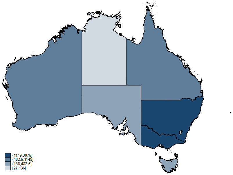
Here we see that New South Wales and Victoria have the two highest number of confirmed cases. However, as with New Zealand, this is only the raw count data. Let’s break it down by population. To do this I will need the population data, which is easily obtainable through wikipedia. To get the population data into Stata I use the online tool, this time I want Table 5 instead of Table 1 wikitable. I am now going to import that data and attach it to my COVID19 data to generate a new map. In the command pane:
frame create pop
frame change pop
import delimited "C:\Users\Laura\Downloads\States_and_territories_of_Australia_5.csv", varnames(1)
rename (stateterritory population2021census) (state population)
drop in 1
replace population=subinstr(population, "," ,"",.)
destring population, replace
format population %16.0gc
frame change map
frlink 1:1 state, frame(pop)
frget population, from(pop)
generate casespercent = (cases/population)*100
grmap casespercent if !missing(casespercent), fcolor(navy*0.2 navy*0.5 navy*0.7 navy*1.0) polygon(data(actmap.dta) fcolor(navy*0.7))
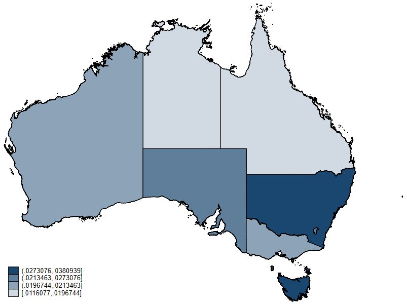
This shows much greater differences compared to what we saw in New Zealand. Victoria was in the top bracket for total number of cases, however when you look at the proportion of the population that is infected they drop to the second lowest bracket. Conversely, Tasmania was in the second-lowest bracket for total number of cases, but is now in the highest bracket for their proportion of population infected. Both Western Australia and Queensland move down a bracket when you look at their number proportionally, and South Australia moves up a bracket. New South Wales, the Australian Capital Territory, and the Northern Territory stay the same.